Zendesk
Zendesk is the Industry Leader in Online Web Support, Live Chat, Knowledge Base, Voice & SMS Software.
Problem
A company with no dedicated customer service team is being inundated with questions by confused clients, and prospective customers.
Vision
- Create and design a knowledge base that is accessible, informative, and navigated with ease.
- Teach laypersons how to properly create, update, and maintain said knowledge base.
- Decrease the amount of incoming questions about "how do I ___?".
- Free up staff to focus on what they were otherwise supposed to be doing.
Research
Confused Clients
We combed through email records, website contact form submissions, and Slack chat histories. We kept a tally:
- What are clients asking about the most?
- Where are they completely lost?
- Where do they need a little clarity?
Knowledge Base
A knowledge base (KB) is a technology used to store complex structured and unstructured information used by a computer system.
A pre-existing, but not even worth mentioning "knowledge base" did exist. It was out of date, and unpresentable. A decision was made to begin anew.
We picked Zendesk - due to it's vast array of customer support products, and it's wide popularity.
Work
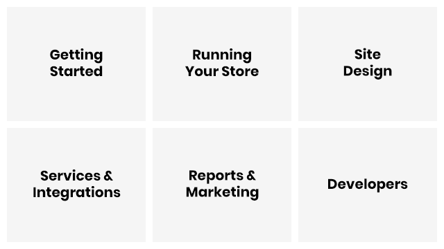
Site Map
Drawing from our research, necessary articles, categories, and subcategories were drawn out, and shuffled around. A somewhat intuitive category structure began to emerge, starting from"Getting Started" all the way up to "Developers".
Design
The deprecated knowledge base was a tangle of 'I guess this will do...', and 'no one will notice' hackery. There were no rules, and no standards. If an administrator wanted an "i" for information icon, they found one on the fly. If they wanted a new header, they made some text bold... and/or black... or maybe blue. Or, whatever seemed nice at the time.
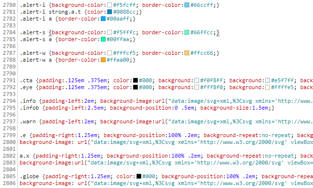
Cascading Style
I created a series of copy/paste snippets, and defined responsive CSS classes. If a link opens in a new window, it has a defined look. If an admin page name is referenced, it has a defined look. If a sentence is a warning box, it has a defined look.
If it is later determined that the look is not optimal - the look can be adjusted. For hundreds of pages, at once.
Laypersons
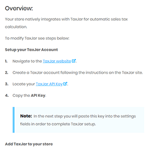
People who may not otherwise know how to code were provided a key, allowing them copy/paste the code they need to achieve the look they want, or convey the meaning they need. Administrators were able to ask for new style definitions as the need arised. Oh - a warning box is not enough here? How about a danger box.
Danger: There is no impending danger, but you probably thought that there was.
Tough Love
Previously, clients had been welcomed into our company Slack channels. Developers, designers, and client managers were not eager, or unable, to engage every random question or complaint that popped into any number of client channels. This lead to a very poor customer experience.
Everyone was politely kicked out.
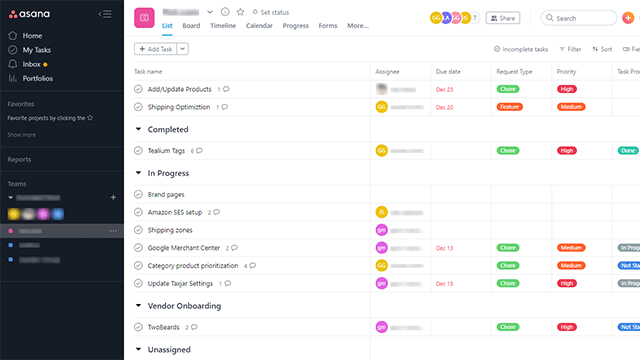
An Asana or Trello board was created for each client. Feature requests and questions were now compiled into one neat and organized place.
Conclusion
Throughout this process, I could not ignore the feeling that there was another problem to address. While a commendable effort was being put into the task of teaching people how to use a product... shouldn't there be just as much effort put into the task of making the product, itself, easier to use? I could write a great tutorial on how a client can upload a new product to his catalog... but, should I need to? What if I just created a better product admin page?
The administrative panel, and essentially every page within it, needed, and still needs, to be improved.
And on that note, to be continued... hopefully.